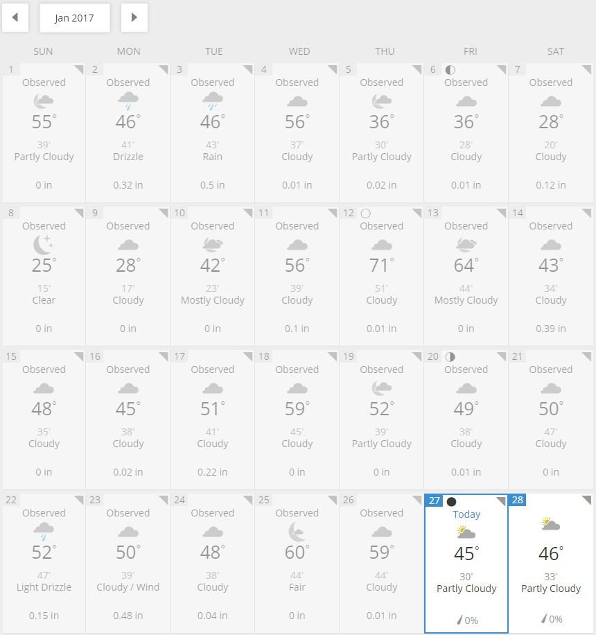
It’s been a grey winter here in Northern Virginia. Not too cold – just grey. It’s been either rain or clouds pretty much since the start of 2017. Don’t believe me? think I’m just being depressing? Take a look at this daily weather record for Washington, DC for January 2017 –

See?
When I lived in Massachusetts, I used to look outside and the grey weather matched most people’s style choices – blacks, greys, browns – it gets a little tiring. So we know we need colors to brighten things up.

Too much?
If you’ve been through our training courses, you’ll know that we at Avolution talk about practicing just enough architecture as a fundamental guiding principle – well try the same idea for color when presenting information in ABACUS – just enough color.

Not bad!
Not surprisingly color is very important, but how do we use it more effectively? There are a couple of key principles:
Grouping is accomplished by similar hues – everyone in the picture is wearing some bluish-green, but notice the males are using green while the females a kind of aqua?
Attention is captivated by colors with higher brightness or chroma – the females in the picture look great and don’t need to be called out, it’s the men that need to be highlighted in the picture and so they are wearing a brighter shade of green.
Differences are shown with contrasting hues – you can use your color wheel for this one: purple v yellow, red v green, blue v orange.
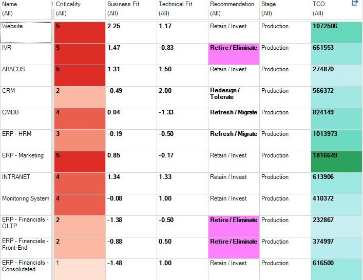
Just because you can, in ABACUS you can get carried away with coloring every column in a catalog and adding five color annotations or heat maps to a single diagram. It’s not enough to follow the principles above, we need to be restrained in our use of color as well. So here’s a couple of additional rules of thumb:
Catalogs should have up to three columns colored, only one should be used for calling out differences
Diagrams should use color to represent up to three dimensions (e.g. component type, and two property values)


